UX Case Study — Creating an Intuitive Search Mechanism for an Online Job Fair Platform

Summary
COMPFEST is the largest student IT Event in Indonesia with over 10000+ participants participating in its events every year. One of the events was the Job and Intern Fair, With over 5500+ applicants and 400+ exhibitors, the UI/UX Team of COMPFEST 14 have to create a solution for the virtual job fair to accommodate the large audiences. I was tasked with creating the UI/UX of the Job and Intern page to be intuitive and easy for the applicants to find the job of their dream and easily apply within the virtual platform.
Project Name
Compfest 14 Job and Intern Fair UI/UX Design
Role
UI/UX Designer
Project Date and Duration
August 1st — August 30th 2022
Goals
- To create a simple and intuitive job posting site for all COMPFEST Job and Intern Fair participant.
- To revamp the existing design to match the new Silicon Design System.
- To reevaluate the design based on user research
Problems
- This project was heavily time-hampered as the team were only given a month to provide final deliverable design to the Software Engineer team.
- The existing solution from COMPFEST 13 requires a significant overhaul to adapt the design to the new Silicon Design System and to fix some of the UI/UX issues left in said solution.
Project Scope
- Provide an end-to-end user journey flow from registering the event to participating in the Academy/Competition event through this online dashboard.
- Determine the user dashboard flow and system
Challenge
- How can I create an intuitive search functionality to accommodate job seeker?
- How can I enhance the main event itself (COMPFEST Main Event) through the utilization of job and intern portal?
Gaining Insight Through Empathizing
Before starting the design, we first took a look at COMPFEST’s target audience to help compose research for this project. We decide that our audience is Indonesian jobseekers in general.
After deciding the target audience, we planned and did a small interview with several people who match our target audience to gain insight on what to improve and what to avoid when creating this event. We did not research our specific tasks first (in this case, mine was designing the search and filter. We collectively research the event in general as a team first while also learning about how to do user interviews effectively from our lead.
User Research
We interviewed several people who fit with our target audience and asked them several questions regarding online events in order to achieve our current research goal. Because of resource constraints, we had to do the research online using voice and video communication software such as Zoom and Google Meet.
Research Goal
The main goal of this research is to gain users’ insight into what aspects of job-finding the users liked or disliked, considerations when selecting and applying for jobs online, and opinions or experiences of attending the current job fair events.
Interview Question Examples
- What are your considerations when applying for job in an online event?
- What do you expect to obtain from searching job in an online job fair?
- If you have attended any online job fair before, how was your experience?
- Imagine your personal experience in internship and job seeking. What is it and what did you like about it?
Establishing the Problems
After conducting the interview, we gathered in an online meeting and discussed while analyzing the interview result using Miro’s sticky notes.
Gathering and Sorting Insights
The first step of analyzing the data is to arrange and group the data to help ease the reading and processing later on. We grouped the data based on the event type, and then the insight within the types. This was made so we can check on each part easier, and to assign the data to our respective tasks.
After grouping the data and assigning them to our respective tasks, we continue to separate it and analyze the problem from the data, which is the user’s voice. We determine the problem, and then create How Might We which then we turn into solutions. The key How Might We from the data that could helped my tasks are:
- Create a search and filter mechanism that is easy to understand while maintaining the engaging aspect of job seeking in Job and Intern Fair
- Give useful information about the job and internship for the users
- Create a job application mechanism that is easy to understand
Wireframing and Prototyping
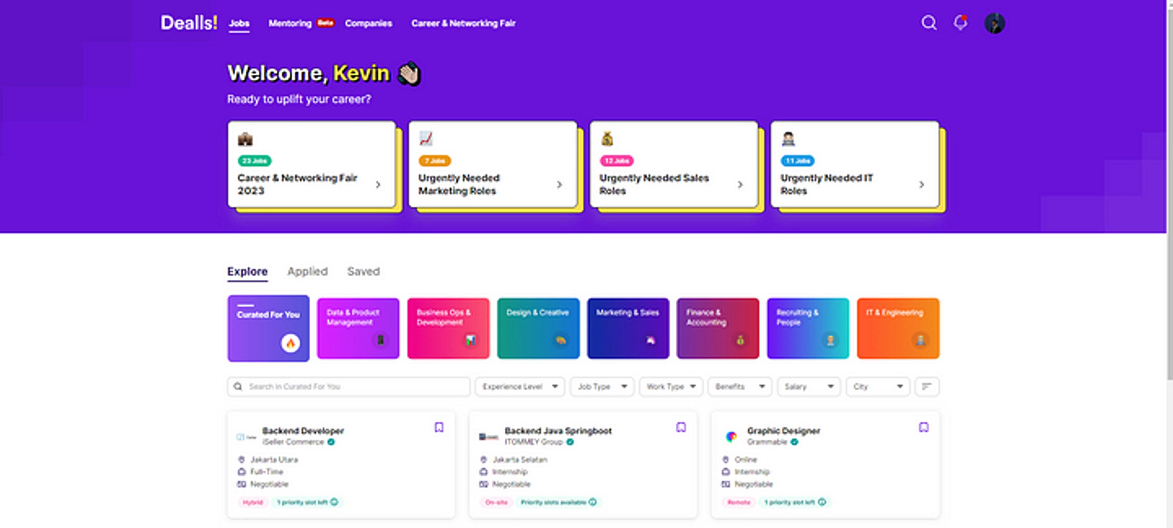
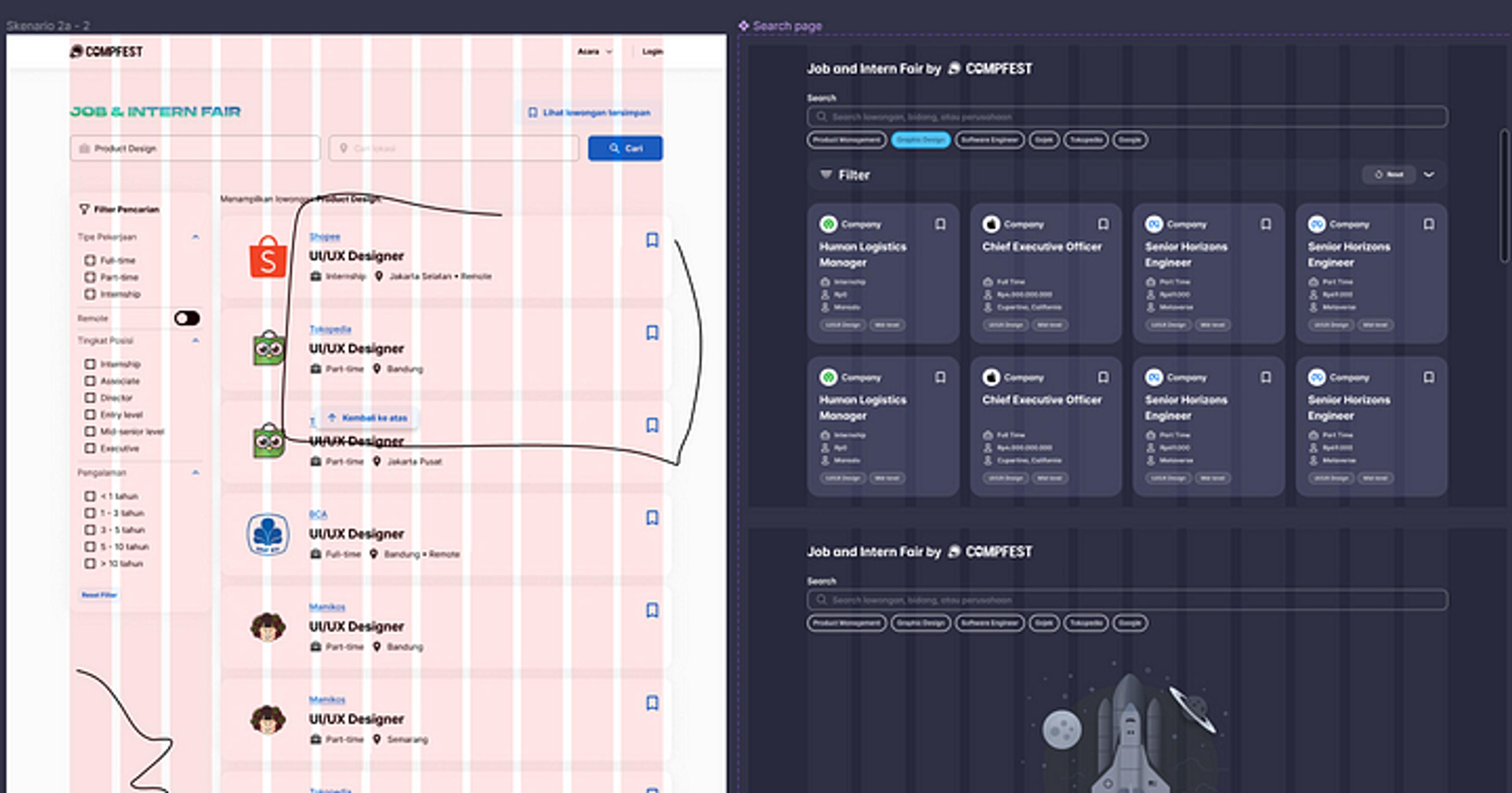
After deciding that I will be designing the search mechanism and main page, I continued the process with creating the high-fidelity prototype and wireframing for the store due to time constraints. I tried to keep in mind the result of the research and tried to create the interface of the website as simple as possible. I also analyze some of other job portal UI designs to understand how to present the job information in an effective and intuitive way. I choose Dealls! job portal as a reference due to user feedback when asked about a top-of-head intuitive job portal design.

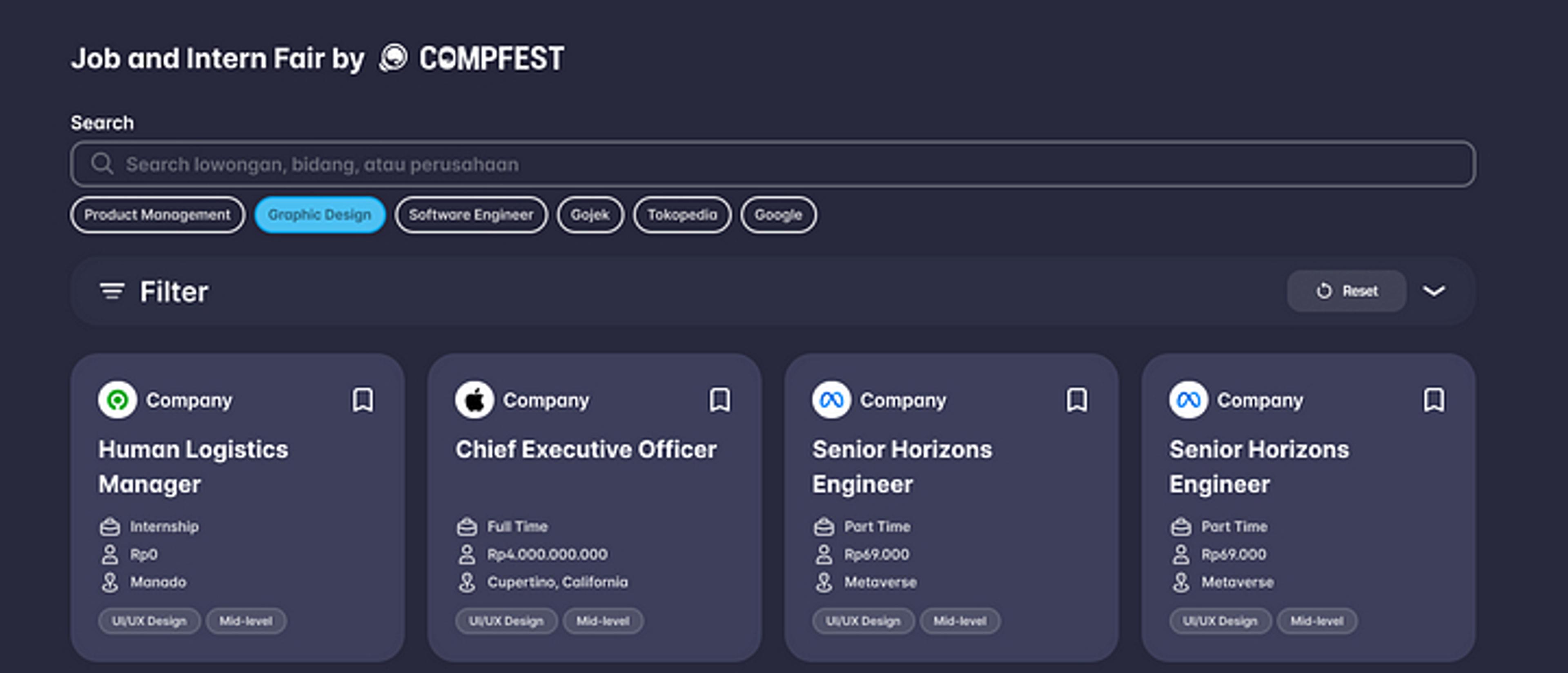
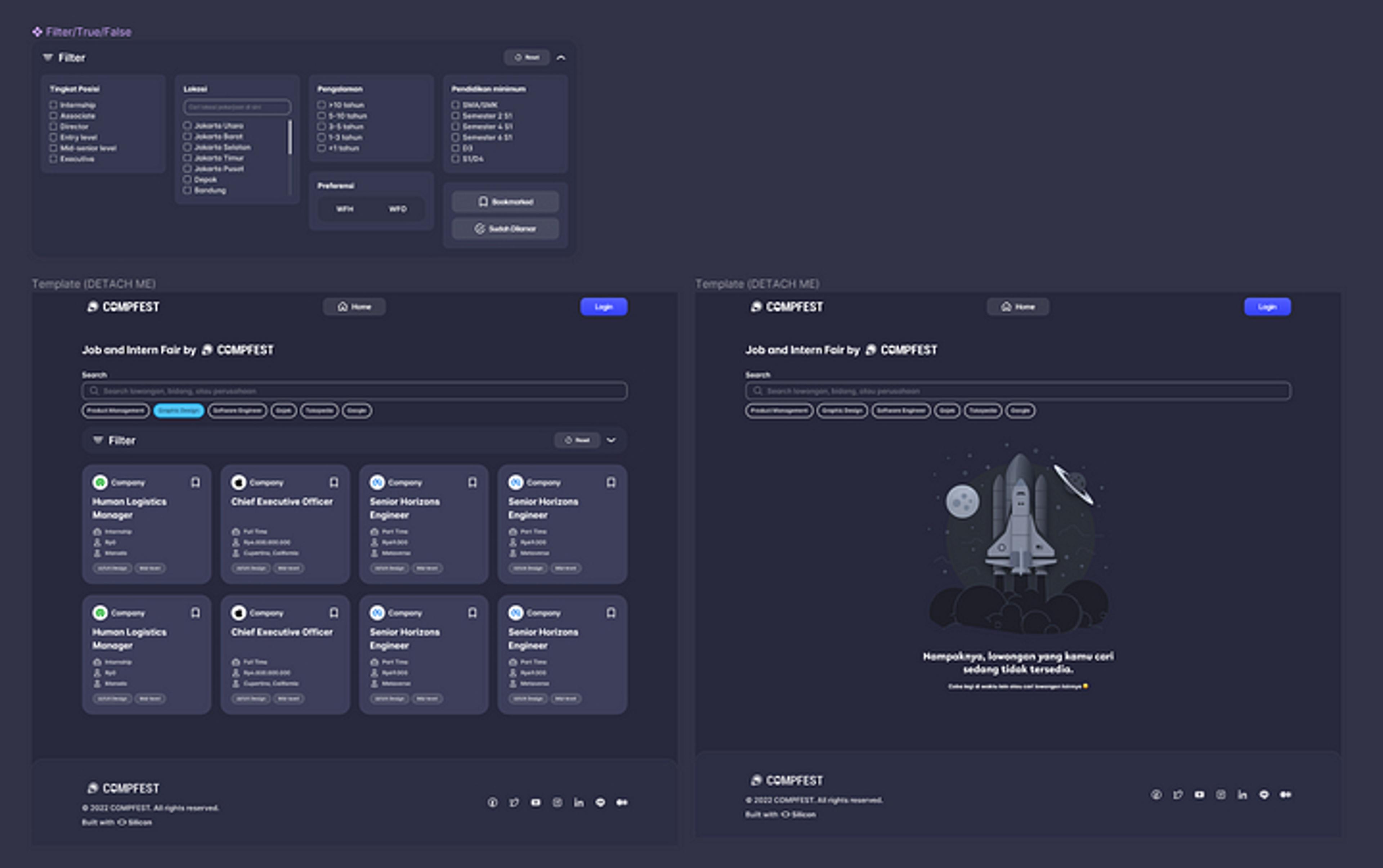
I started working on the high-fidelity prototype using Figma. I tried creating as close as the hoped finished implementation would look like. I matched the looks of the machine with Silicon Design System — the existing design system for COMPFEST 14, and did several explorations of the visuals.


Usability Testing and Design Reiteration
Creating solution without checking if the solution works is bad practice, therefore my team and I planned a usability test on the working prototype.
Usability Test
Usability Test is a research method where the user will be ask to complete certain task using the prototype while the interviewer will observe their behavior. I interviewed 3 people who have different experiences of job and internship seeking to diversify the result and obtain as much data as possible. Because of the pandemic, I had to do the research online using voice and video communication software such as Discord and Google Meet.
The Result
After conducting the usability test, I found out that the current job and intern fair site is already good because all of the users are able to navigate through it. At this point, we are approaching our launch date really fast and we don’t have anymore time to research or redesign. Fortunately, as we shifted our focus to build and implement the design to live website, the developer team didn’t stumble upon any issues regarding the design because I reused a lot of the same components from the Silicon Design System so implementation went on smoothly onto the launch date.
The Launch and Impact
Finally. the moment we’ve been waiting for, the implementation and the launch of the feature. The Job and Intern Fair was scheduled to open at October-November 2022 alongside other digital products to accompany the main event of COMPFEST which was held in University of Indonesia. During those times, people are able to visit the Job and Intern Fair site and apply to the available job and intern positions.
Conclusion
COMPFEST 14 was a success even though by not a huge margin. Handling this project was quite exhausting but really fun. I learned a lot again from my manager and the person in charge who guided me through and I could experience a real design sprint from the beginning to the end. To see something I designed would be implemented and used by real people was really rewarding for me and I’m quite satisfied with the result. There might be some mistakes here and there, but I hope I could learn more from this experience.


